
Dangschat T.O.H. · Shopify Redesign & Visual System
Three trading divisions, one clear route through the site.
Dangschat T.O.H. trades across three distinct sectors — food, chemicals and pharmaceuticals — each with its own buyers, requirements and vocabulary.
The previous website treated those divisions as an afterthought. For a business whose credibility rests on sector expertise, a site that obscured which sectors it served was working against the sales conversation rather than supporting it.

Project scope
Three areas of work.
UX & Information Architecture
Navigation and category structure rebuilt around the three business divisions, so a buyer can reach their sector directly from the first screen.
Shopify Build & Visual System
A modular Shopify layout using colour-coded sections, iconography and product highlights to give each division a distinct identity within one coherent look.
SEO & Content Structure
SEO-led copywriting and structured metadata, with a content hierarchy built so each division is discoverable on its own terms.
The challenge
What was not working.
Before the rebuild, the site communicated neither the breadth of the business nor the specialism within it. Potential business clients arriving on the old site had no fast way to identify whether the company served their sector.
- No clear visual hierarchy or product segmentation
- The three core divisions hidden behind inconsistent layouts
- Outdated navigation that made categories hard to reach
- No mobile optimisation, making browsing difficult for business clients
What n-2v changed
Strategy, message, experience, structure.
-
Modular UX/UI architecture
Intuitive category access built around how buyers search, rather than how the catalogue was organised internally.
-
Division-led visual system
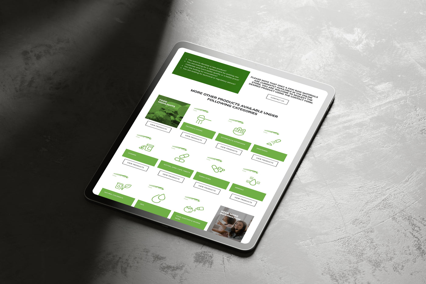
Food, chemicals and pharmaceuticals each given colour-coded sections, icons and product highlights inside one consistent design.
-
Multi-department landing flow
A route that lets a visitor identify their industry immediately and move into the relevant range without detours.
-
SEO-optimised content structure
Rewritten copy and structured metadata supporting organic visibility for each division.
-
Responsive build across devices
A layout that works properly on phones and tablets, where a growing share of B2B browsing now begins.
The outcome
What changed for the business.
Qualitative improvements visible in the rebuilt site following launch.
- The three divisions are identifiable from the first screen
- More direct navigation between product categories
- Full mobile support for the first time
- A stronger, more consistent visual identity aligned with the company's B2B positioning
Visual proof
Before and after.
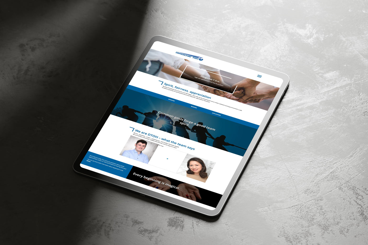
Screenshots of the client's actual site, captured before and after the rebuild.
Bring clarity to your next digital priority.
A short discovery call is enough to establish whether this way of working fits your organisation.
Book a GRID-OS Discovery Call