
Badura · Product Photography & Shopify Storefront
A storefront that finally looks like the shoes it sells.
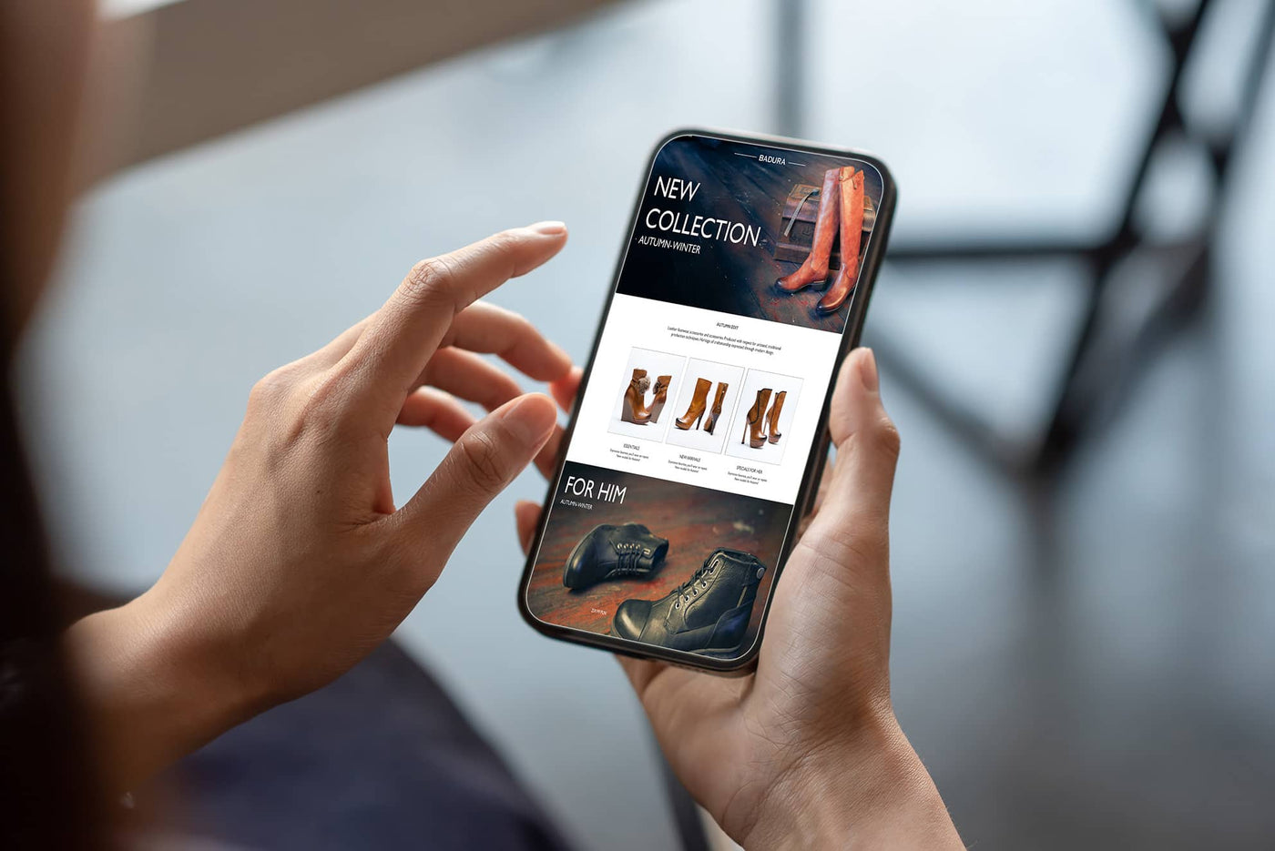
Badura is a premium footwear brand selling online. The products carried a level of craft and finish that the shop itself did not convey.
For a brand competing on perceived quality, that gap is commercial rather than cosmetic. Customers judge materials and construction from photographs alone — and inconsistent imagery reads as an inconsistent product.

Project scope
Three areas of work.
Product Photography
Studio-grade packshots shot to a fixed lighting and angle specification, so every product on the site sits in the same visual world.
Shopify Storefront
A mobile-first, conversion-focused layout with categories, typography and pacing built around the new imagery rather than bolted on afterwards.
Social Content
An Instagram Reels campaign extending the visual identity into motion — product spotlights, behind-the-scenes and seasonal styling.
The challenge
What was not working.
Before the work, the online shop did not reflect the elegance of the products it was selling. The imagery was doing none of the persuasive work a premium brand needs it to do.
- Generic photography with inconsistent lighting and angles
- No visual storytelling across the product range
- Brand perception falling short of the actual product quality
- Friction in the buyer journey
What n-2v changed
Strategy, message, experience, structure.
-
Studio-grade packshots
Clean, detailed product images with consistent lighting and angles across the full range, shot to a repeatable specification.
-
Conversion-focused Shopify layout
A mobile-first storefront aligned to the brand's positioning, built so the photography carries the page rather than decorating it.
-
Content structure and performance
Intuitive product categories, faster pages and typography chosen to sit quietly behind the imagery.
-
Photography planned as user experience
Each shot briefed to answer a buying question — material, fit, detail — rather than simply to look attractive.
-
Instagram Reels campaign
Short-form content extending the same visual language into motion and directing attention back to the store.
The outcome
What changed for the business.
Qualitative improvements following the relaunch.
- A storefront whose presentation matches the quality of the product
- Consistent visual treatment across the entire product range
- A mobile-first buying journey with fewer points of friction
- A social presence sharing one visual language with the store
Visual proof
Before and after.
Screenshots of the client's actual site, captured before and after the rebuild.
Bring clarity to your next digital priority.
A short discovery call is enough to establish whether this way of working fits your organisation.
Book a GRID-OS Discovery Call