
VELARI — self-initiated concept · Premium Digital Experience Design
A hypercar brand with no heritage — designed to create desire through one connected digital experience.

VELARI is a self-initiated concept by N-2V: a limited-production hypercar brand imagined to explore how an unfamiliar name can communicate exclusivity without heritage, racing history or an established badge.
The answer was not a product website. It was a digital system designed to create desire, explain the product, and move a potential owner from discovery to configuration and allocation — the same joined-up thinking N-2V brings to client websites and ecommerce.
Project scope
Three areas of work.
Experience architecture
A journey deliberately sequenced as desire → exploration → understanding → choice, rather than a catalogue of specifications.
Art direction & colour system
Colour treated as structure, not pigment — four distinct states built as one recognisable identity.
Configurator & allocation UX
A deliberately controlled set of choices that resolve to a single allocation value inside one surface.
The challenge
What was not working.
Luxury experiences often begin with emotion, then collapse into spec sheets, galleries and conventional configurators. For VELARI, the goal was to keep the intensity of the first impression alive through the entire journey.
- An unfamiliar brand with no heritage or badge to lean on
- Emotion that usually dies at the specification sheet
- Colour treated as a cosmetic afterthought rather than identity
- Exploration that feels like a catalogue, not a reveal
- No credible path from interest to allocation
What n-2v changed
Strategy, message, experience, structure.
-
Cinematic first impression
An opening that behaves like a product reveal — the car dominates while typography, specification and navigation stay restrained.
-
Colour as a product system
Four colour states — Nocturne, Ignis, Kyanite and Verde Alba — each a version of the car's personality within one identity.
-
Exploration before configuration
A 'walk around it' moment that lets visitors read proportion and performance before any decision is asked.
-
Storytelling into allocation
A restrained allocation interface where selections reflect visually and resolve to a single value.
-
One system, not a set of screens
Shared principles — hierarchy, editorial typography, colour-as-interface, progressive disclosure — so every stage feels like one product.
The outcome
What changed for the business.
As a concept, VELARI is a demonstration rather than a launched product — so these are qualitative design outcomes, not performance metrics.
- A premium identity established in the first screen, without heritage or badge
- Colour turned into a meaningful part of the product story
- Exploration that feels deliberate rather than catalogue-like
- Storytelling, specification and configuration connected into one flow
- A credible path from first impression to allocation
Design direction
How the system was designed to work.
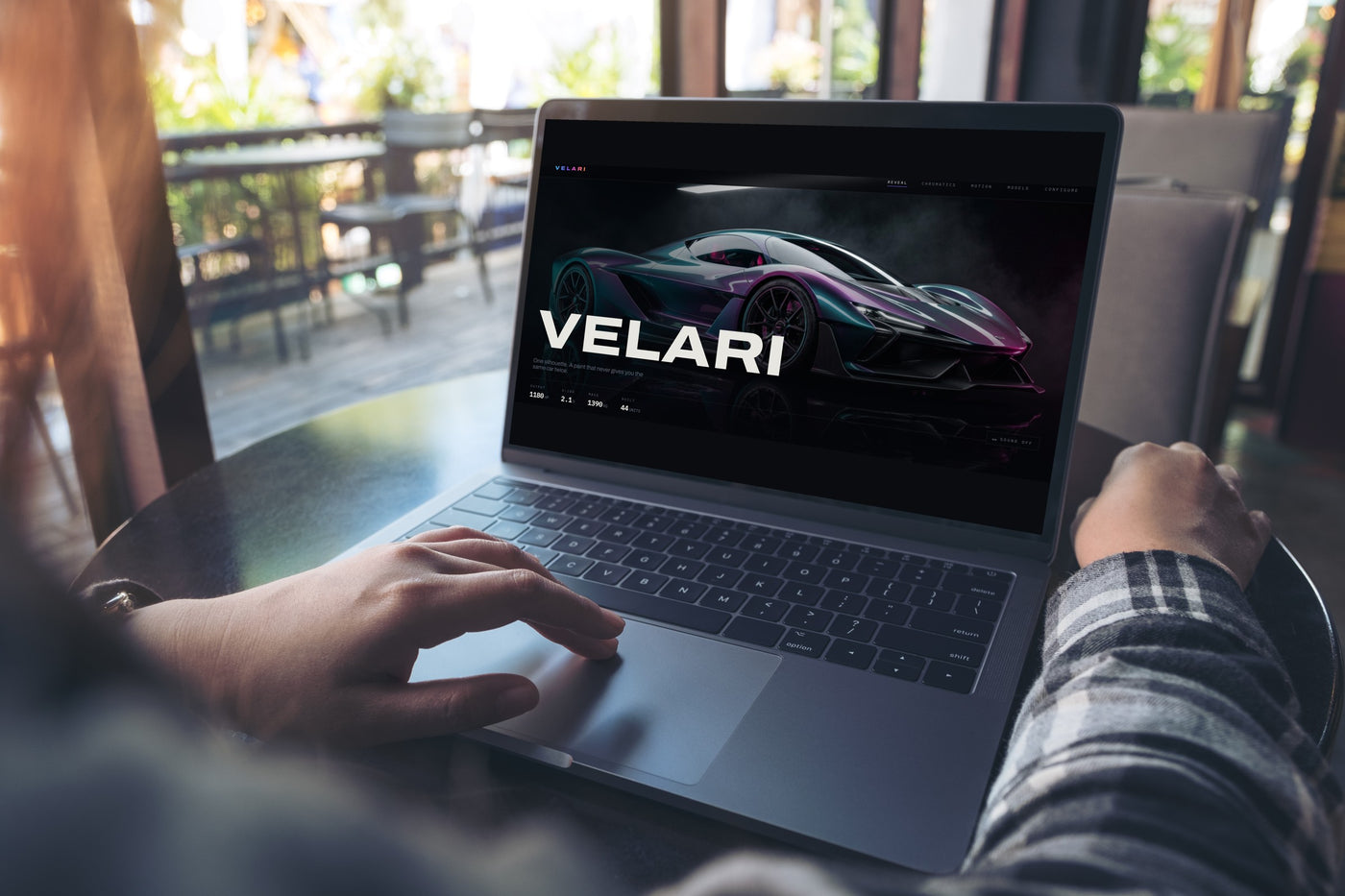

Conceptual project visuals, created to illustrate the design approach. They are not screenshots of the delivered site.
Visual proof
Before and after.
Four states of one identity. The silhouette never changes — only where the interference stack is tuned to sit.


“The website is not a communications layer added after the product. The experience becomes part of how the product is understood, desired and ultimately selected.”
Bring clarity to your next digital priority.
A short discovery call is enough to establish whether this way of working fits your organisation.
Book a GRID-OS Discovery Call